Jon Dinapoli, Creative Director12.05.16
I have had the great fortune of working with Sarah Jessica Parker for over a decade as the creative director on her fragrance brands. Lovely, which is now in its 10th year, was our first project together. The development of Lovely—from the packaging to the visuals to the scent—was extremely collaborative and creative. Lovely had a very specific point of view and unique characteristics for the time. Fast forward 10 years and we have taken the same developmental approach to Stash, just with very different codes.
The idea of Stash was created in SJP’s mind many years ago, however, it wasn’t ready to come out until now. Consistent with all fragrance brands she’s launched, this project started with the fragrance itself. She had dabbled quietly over the years on developing and experimenting with it, so when it came time to actually work with IFF, she knew exactly what she wanted.
Simultaneously, the name Stash SJP came to life. The fragrance was SJ’s secret “stash” for all this time and now she was ready to share it with the world.
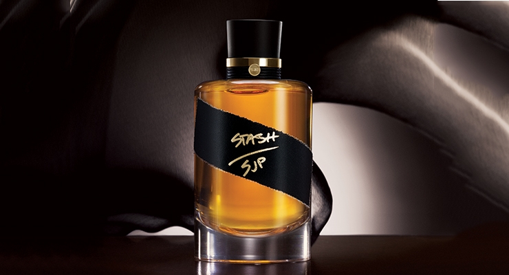
And so the packaging and design began. With the fragrance and name complete, I had a tremendous amount of inspiration to design. We were inspired by something authentic, mysterious, secretive, apothecary or old fashioned—hand made. We knew it would be a dark cognac color. I looked back and researched perfumes and oils from decades ago and was intrigued by the rawness and simplicity of the packaging, but still focusing on handcrafted details and craftsmanship.
We loved the idea that it was packaged right from the lab in the glass and materials they had there. It’s the moment she was in the lab finalizing the scent and grabbed the vial, poured the juice in, corked the top, ripped a piece of tape and feverishly signed—Stash SJP! That’s it. This is how the packaging concept was born. Once we agreed on this concept (which by the way is not far from how it really happened), I had the challenge of transitioning it into something that was qualitative, desirable and produce-able.
I started with the glass. We were very much into this laboratory/vial style glass, but were highly conscious of the price point and making sure the consumer got the value she (or he) deserved. By staying with a simple cylindrical shape, I added a heavyweight curved shape to the heel of the glass. This qualitative detail sharply contrasted the simple shape of the outside perfectly. Making the comp was the easy part; it had a perfect “smile” and it was consistent from comp to comp. As we all know, blowing glass is much less perfect. I pushed and pushed to get the shape and depth of the heel just as we envisioned it. It was a very hard task to complete, but I am very happy with what we were able to produce.
The cap was inspired by the shape and function of an old fashioned cork. We actually explored using a real cork material, but it didn’t feel upscale enough. So instead we modeled the matte black cap shape from a cork stopper. Adding the hand tied matte cord and signature gold SJP emblem around the gold collar completed the look. The combination of these materials feels authentic—slightly vintage yet understated.
My favorite part of the package, and the most challenging, is the textured black tape. In development we hand ripped gaffer’s tape for every piece. We all fell in love with the uniqueness and rawness of every bottle. It was literally like she ripped each one and individually signed them. We tried dozens of methods to replicate this in mass production and keep the authentic look. Well, that didn’t work—so in the end, each piece for all production is hand ripped and hand applied, just as SJ and I did for the comps.
The bottle comes in a standard folding carton which has a glossy black background with the tape replicated by matte finishing and embossing texture. To add the “Stashlike” nature of the brand, I thought it was important to also have a pouch to hold the bottle.
Bengaline is a material that is used consistently through her fashion brand, so I chose a black bengaline with gold cord and gold logo.
From the initial brainstorm session to the on-counter date was a remarkable 12-month period. This is by far the fastest new launch I have ever developed. I met with SJ probably twice a month (sometimes more) on every aspect of design and production. This was the only way we could have perfected every detail so seamlessly and efficiently.
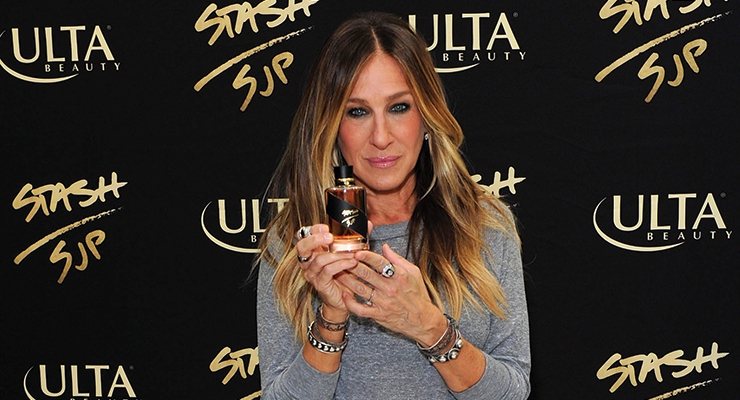
In Sarah Jessica’s own words, “One of the hardest secrets I’ve ever been asked to keep. A scent we’ve spent years perfecting. Passed among a select few like a verboten substance. Offered up only in secret but no longer.”
ABOUT THE AUTHOR:
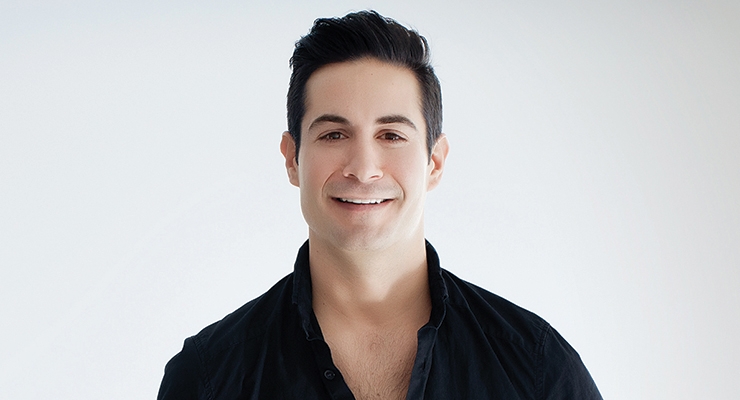
Jon Dinapoli is the creative director of Sarah Jessica Parker Fragrances and co-founder/creative director of Walsh House, a branding and creative agency focused on the luxury goods sector. A creative director, designer and leader with more than 16 years of experience in the beauty and fashion industry, Dinapoli previously held the position of VP of Creative at Coty. There he designed and launched many fragrance and cosmetic brands, including Calvin Klein, Marc Jacobs, Balenciaga, Vera Wang, Jennifer Lopez, Sarah Jessica Parker, Gwen Stefani and Madonna. He oversees overall brand development, package design, advertising, graphic design, in-store, photography, retouching, promotions and more.
The idea of Stash was created in SJP’s mind many years ago, however, it wasn’t ready to come out until now. Consistent with all fragrance brands she’s launched, this project started with the fragrance itself. She had dabbled quietly over the years on developing and experimenting with it, so when it came time to actually work with IFF, she knew exactly what she wanted.
Simultaneously, the name Stash SJP came to life. The fragrance was SJ’s secret “stash” for all this time and now she was ready to share it with the world.
And so the packaging and design began. With the fragrance and name complete, I had a tremendous amount of inspiration to design. We were inspired by something authentic, mysterious, secretive, apothecary or old fashioned—hand made. We knew it would be a dark cognac color. I looked back and researched perfumes and oils from decades ago and was intrigued by the rawness and simplicity of the packaging, but still focusing on handcrafted details and craftsmanship.
We loved the idea that it was packaged right from the lab in the glass and materials they had there. It’s the moment she was in the lab finalizing the scent and grabbed the vial, poured the juice in, corked the top, ripped a piece of tape and feverishly signed—Stash SJP! That’s it. This is how the packaging concept was born. Once we agreed on this concept (which by the way is not far from how it really happened), I had the challenge of transitioning it into something that was qualitative, desirable and produce-able.
I started with the glass. We were very much into this laboratory/vial style glass, but were highly conscious of the price point and making sure the consumer got the value she (or he) deserved. By staying with a simple cylindrical shape, I added a heavyweight curved shape to the heel of the glass. This qualitative detail sharply contrasted the simple shape of the outside perfectly. Making the comp was the easy part; it had a perfect “smile” and it was consistent from comp to comp. As we all know, blowing glass is much less perfect. I pushed and pushed to get the shape and depth of the heel just as we envisioned it. It was a very hard task to complete, but I am very happy with what we were able to produce.
The cap was inspired by the shape and function of an old fashioned cork. We actually explored using a real cork material, but it didn’t feel upscale enough. So instead we modeled the matte black cap shape from a cork stopper. Adding the hand tied matte cord and signature gold SJP emblem around the gold collar completed the look. The combination of these materials feels authentic—slightly vintage yet understated.
My favorite part of the package, and the most challenging, is the textured black tape. In development we hand ripped gaffer’s tape for every piece. We all fell in love with the uniqueness and rawness of every bottle. It was literally like she ripped each one and individually signed them. We tried dozens of methods to replicate this in mass production and keep the authentic look. Well, that didn’t work—so in the end, each piece for all production is hand ripped and hand applied, just as SJ and I did for the comps.
The bottle comes in a standard folding carton which has a glossy black background with the tape replicated by matte finishing and embossing texture. To add the “Stashlike” nature of the brand, I thought it was important to also have a pouch to hold the bottle.
Bengaline is a material that is used consistently through her fashion brand, so I chose a black bengaline with gold cord and gold logo.
From the initial brainstorm session to the on-counter date was a remarkable 12-month period. This is by far the fastest new launch I have ever developed. I met with SJ probably twice a month (sometimes more) on every aspect of design and production. This was the only way we could have perfected every detail so seamlessly and efficiently.
In Sarah Jessica’s own words, “One of the hardest secrets I’ve ever been asked to keep. A scent we’ve spent years perfecting. Passed among a select few like a verboten substance. Offered up only in secret but no longer.”
ABOUT THE AUTHOR:
Jon Dinapoli is the creative director of Sarah Jessica Parker Fragrances and co-founder/creative director of Walsh House, a branding and creative agency focused on the luxury goods sector. A creative director, designer and leader with more than 16 years of experience in the beauty and fashion industry, Dinapoli previously held the position of VP of Creative at Coty. There he designed and launched many fragrance and cosmetic brands, including Calvin Klein, Marc Jacobs, Balenciaga, Vera Wang, Jennifer Lopez, Sarah Jessica Parker, Gwen Stefani and Madonna. He oversees overall brand development, package design, advertising, graphic design, in-store, photography, retouching, promotions and more.
