
Beauty brands, retailers, and package designers know all too well the importance of color—and what it says about a product and brand.
Color has the ability to directly affect sales. It says so much to consumers, in seconds, so it’s important to get it right.
Pantone’s Color of the Year has influenced product development and purchasing decisions for the past 23 years, in multiple industries—beauty, fashion, home furnishings, industrial design, product packaging, and graphic design.
As a reference, if you’re looking for some inspiration for your next launch—here is a look back at the Pantone Color of the Year from 2016 through 2022 and what each represents.
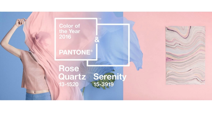
- 2016: Rose Quartz & Serenity—warm Rose Quartz conveys compassion and composure; Serenity’s blue tones reflect calmness and relaxation. It also reflects the ‘gender blur’ trend, and harmony in a chaotic world.
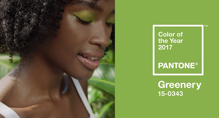
- 2017: Greenery—Harmonious, modern, restorative & renewing. It also sends an environmental message. (And had great beauty pairings.)
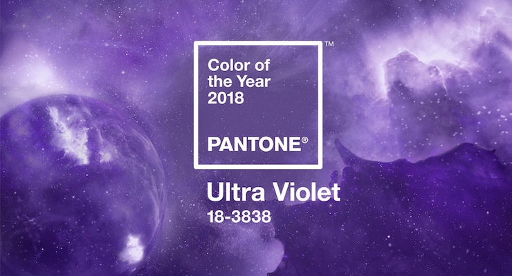
- 2018: Ultra Violet—Bold, creative, mysterious & spiritual
- 2019: Living Coral—Joyful, life-affirming, and a reminder of the endangered coral reefs.
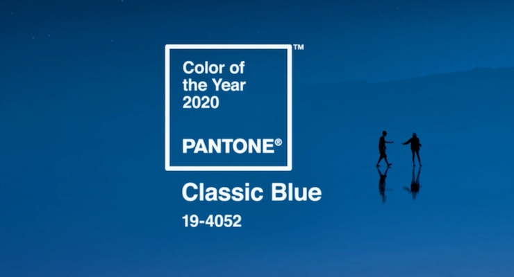
- 2020: Classic Blue—Timeless, enduring, and elegant. Or is it boring, as some critics said? Firmenich said it tastes like blueberries & smells like the sea.
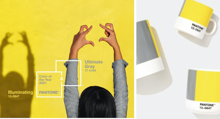
- 2021: Illuminating & Ultimate Gray—A duo that conveys strength and hope.The pairing is optimistic, thoughtful, aspirational, and everlasting.
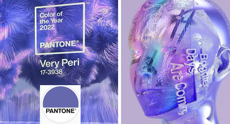
- 2022: Very Peri—A brand new color, for the first time ever, to represent the world’s transformation. Creative, curious, gratitude, and ‘a new vision’ are the words Pantone uses to describe it.
