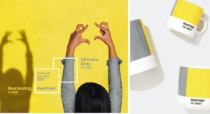
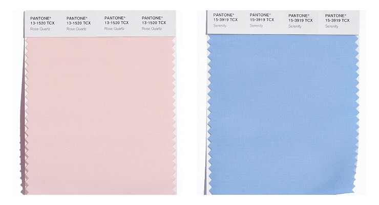
The news is out - Rose Quartz and Serenity are Pantone’s Colors of the Year for 2016 - and it's the first time the color authority has chosen two colors, here’s why.
Color Pairings
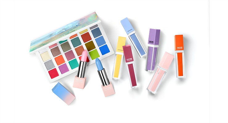
Sephora has already revealed a first look from its annual Sephora + Pantone Universe product lineup, which includes lip, eye and cheek colors in Serenity, Rose Quartz - plus complementary hues.
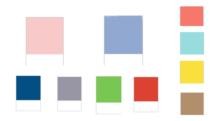
The new color duo pairs well with mid-tones such as greens and purples, rich browns, and all shades of yellow and pink. For a little sparkle, add silver or hot brights, Leatrice Eiseman, executive director, Pantone Color Institute, suggests. (See the slideshow above to see the colors that Rose Quartz and Serenity pair well with - which are also the top 10 colors in fashion for 2016. And more about this is below.)
See more color pairings here on Pantone's site.
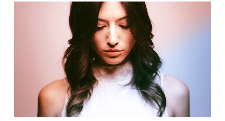
Using Rose Quartz & Serenity in Beauty
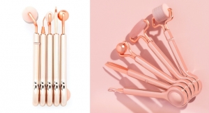
When used in beauty products, Serenity and Rose Quartz are ideal for lip, cheek and eye palettes - plus nail lacquer. The shades are flattering for many skin tones, when used “with a light touch for a soft, natural look,” says Eiseman.
Rose Quartz is especially flattering. The rosy pink is ideal for lips, cheeks and eyes, in both matte and glossy finishes. Blend it with Serenity, Pantone suggests, for a neutral-based eye shadow palette. Both colors will look creative and playful when used for nail lacquer, nail art, or even hair color.
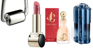
Rose Quartz & Serenity in Packaging & Graphic Design
When used in graphic design and for packaging, Pantone expects that consumers will feel immediately drawn to the new color combination. Eiseman says, “the duo represents a strong yet calming, romantic yet subtle mood that will entice consumers.”
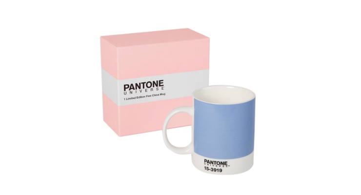
We are likely to see Serenity and Rose Quartz being used for a variety of products and packaging in 2016, across all industries. “With packaging becoming increasingly more tied into lifestyle color trends, the combination of Serenity and Rose Quartz is a natural fit for many kinds of packaging materials,” Eiseman says.
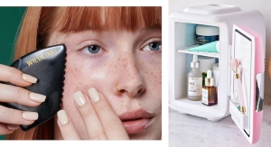
Home & Fashion
In the home industry, Crate & Barrel and Kitchenaid are two companies that have partnered with Pantone to design products that are sure to be popular for the upcoming year.
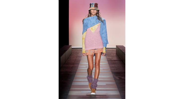
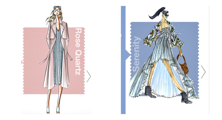
In Fashion, designers were inspired to use Serenity and Rose Quartz in their runway collections for Spring 2016. Both colors are on Pantone’s list of "top ten colors for men’s and women’s fashion for Spring 2016,” which also includes: Buttercup, Lilac Gray, Iced Coffee, Peach Echo, Snorkel Blue, Limpet Shell, Fiesta and Green Flash.
(All are shown in the slideshow above - and these are also complementary colors ideal for use with Rose Quartz and Serenity in beauty palettes.)
Eiseman commented on the colors spotted in fashion, in designer’s Spring 2016 collections, saying, ”Colors this season will transport us to a happier, sunnier place where we feel free to express a wittier version of our real selves.”
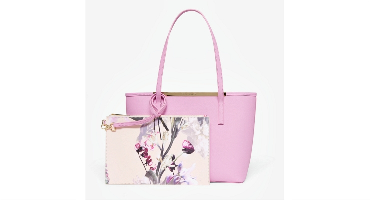
Fashion designers using Rose Quartz for the upcoming season include Tosia, Houghton, M.Patmos, and Charles Youssef. Fashion designers using Serenity include Emilio Sosa, Rachel Pally and Harbison. Designers that incorporated the color duo into their collections are: Rachel Pally, Kung Katherine, Leanne Marshall, David Hart and BCBG, among others.
Read More:
Online Exclusive: Why Pantone Chose Rose Quartz & Serenity as its 2016 Colors of the Year
Color Pairings
Sephora has already revealed a first look from its annual Sephora + Pantone Universe product lineup, which includes lip, eye and cheek colors in Serenity, Rose Quartz - plus complementary hues.
The new color duo pairs well with mid-tones such as greens and purples, rich browns, and all shades of yellow and pink. For a little sparkle, add silver or hot brights, Leatrice Eiseman, executive director, Pantone Color Institute, suggests. (See the slideshow above to see the colors that Rose Quartz and Serenity pair well with - which are also the top 10 colors in fashion for 2016. And more about this is below.)
See more color pairings here on Pantone's site.
Using Rose Quartz & Serenity in Beauty
When used in beauty products, Serenity and Rose Quartz are ideal for lip, cheek and eye palettes - plus nail lacquer. The shades are flattering for many skin tones, when used “with a light touch for a soft, natural look,” says Eiseman.
Rose Quartz is especially flattering. The rosy pink is ideal for lips, cheeks and eyes, in both matte and glossy finishes. Blend it with Serenity, Pantone suggests, for a neutral-based eye shadow palette. Both colors will look creative and playful when used for nail lacquer, nail art, or even hair color.
Rose Quartz & Serenity in Packaging & Graphic Design
When used in graphic design and for packaging, Pantone expects that consumers will feel immediately drawn to the new color combination. Eiseman says, “the duo represents a strong yet calming, romantic yet subtle mood that will entice consumers.”
We are likely to see Serenity and Rose Quartz being used for a variety of products and packaging in 2016, across all industries. “With packaging becoming increasingly more tied into lifestyle color trends, the combination of Serenity and Rose Quartz is a natural fit for many kinds of packaging materials,” Eiseman says.
Home & Fashion
In the home industry, Crate & Barrel and Kitchenaid are two companies that have partnered with Pantone to design products that are sure to be popular for the upcoming year.
In Fashion, designers were inspired to use Serenity and Rose Quartz in their runway collections for Spring 2016. Both colors are on Pantone’s list of "top ten colors for men’s and women’s fashion for Spring 2016,” which also includes: Buttercup, Lilac Gray, Iced Coffee, Peach Echo, Snorkel Blue, Limpet Shell, Fiesta and Green Flash.
(All are shown in the slideshow above - and these are also complementary colors ideal for use with Rose Quartz and Serenity in beauty palettes.)
Eiseman commented on the colors spotted in fashion, in designer’s Spring 2016 collections, saying, ”Colors this season will transport us to a happier, sunnier place where we feel free to express a wittier version of our real selves.”
Fashion designers using Rose Quartz for the upcoming season include Tosia, Houghton, M.Patmos, and Charles Youssef. Fashion designers using Serenity include Emilio Sosa, Rachel Pally and Harbison. Designers that incorporated the color duo into their collections are: Rachel Pally, Kung Katherine, Leanne Marshall, David Hart and BCBG, among others.
Read More:
Online Exclusive: Why Pantone Chose Rose Quartz & Serenity as its 2016 Colors of the Year