Viktorija Gnatoka, Global Packaging Analyst at Mintel08.21.15
The insides of carton packaging, and the inserts you often find there, may seem uninteresting and an easy space to overlook. However with a little imagination and careful thought about how consumers access products via the outer carton, this space offers a myriad of opportunities to extend brand messaging and create meaningful brand moments.

The author, Viktorija Gnatoka, Global Packaging
Analyst at Mintel
Currently cartons are offering little beyond the first in-store attraction. According to Mintel’s Beauty and Personal Care Packaging Trends report, 42% of consumers in the UK throw away extra packaging (i.e. the carton box) as soon as they start using a beauty/personal care product.
Secondary packaging can also be perceived as excessive, a potential negative association, leading consumers to focus on the packaging as waste.
Increasingly Mintel has observed niche brands leveraging the “empty space” of outer packages for their own and consumers’ benefits.
Many packs are overwhelmed with information, so moving some of this to the inside of the cartons could help brands to declutter, leaving designs that are simple and easy-to-understand.
One category where this could show immediate gains is in skincare, for example, where Mintel research shows that 10% of female consumers agree that they do not understand many product claims. This is just one of the cases where brands could improve claim positioning by leveraging additional space on pack, giving information more room to communicate and win over the consumer.
Mintel’s GNPD (Global New Product Database) tracks new product launches around the world and we have noticed brands that are already leveraging the extra inner space of the outer cartons. Some companies are expanding and adding details about the product. The others are using that space to interact with consumers and engage them in a beauty regimen or specific brand cause.
Ciate Carton
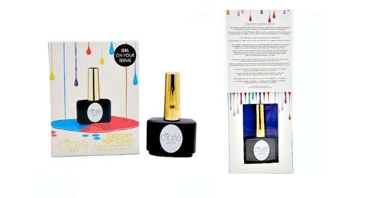
Ciate Geltox by Ciate
Country: UK
Packaging for Ciaté Geltox Top Coat (at left) employs a simple, decluttered design principle and is decorated with a “mindful” use of color.
The design architecture carries over to the inside of the flip-top-style carton, where application instructions are easily accessed via a carton that is printed on the inside.
Pranarom International
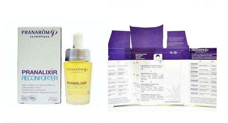
Cosmétique Adaptarom Pranalixir by Pranarôm International
Country: France
Pranarôm Cosmétique Adaptarom (at left below) has effectively and simply combined graphics for application with a well-organized list of complementary products and attributes.
The designers have resisted the urge to cover every available internal space or available space with text or a graphic.
This strategy results in a vast amount of information being presented without appearing cluttered.
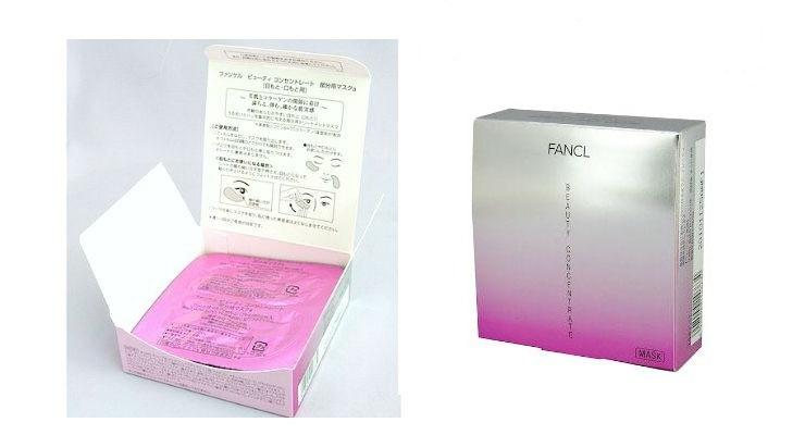
Eye & Mouth Mask by Fancl Beauty
Eye and Mouth Mask by Fancl
Country: Japan
Fancl Beauty Concentrate Eye and Mouth Mask packaging takes advantage of this lay-flat package style, using the underside of the flip-top lid to offer an easy-to-follow set of graphics and text communication instructions that allow for easy, no-hand reading, which aides in the simultaneous use of the product.
Pulpe Vitaminée 1st Wrinkle by Caudalie France
Country: France
Caudalie has employed a step-by-step set of show-and-tell instructions that don’t appear to be crowded or overbearing.
Consumers today rely on packaging as a communication tool to understand use/preparation instructions.
Highlighting brand or even functional packaging attributes using a combination of graphics and text (show and tell) communication tools share just enough to get the job done for those in a hurry, or the full story for consumers who want or need more information.
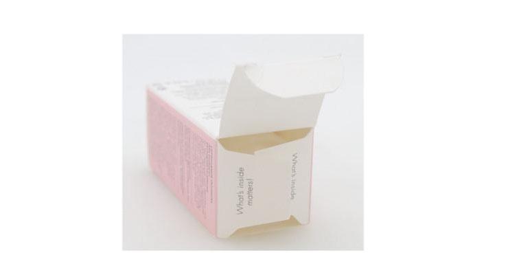
Estelle & Thild
BioHydrate by Estelle & Thild
Country: Sweden
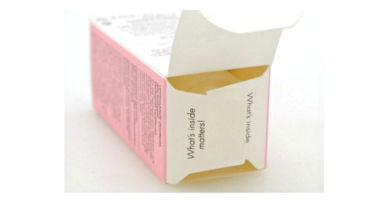
Other brands are leveraging the opening part of the pack to give consumers quick reminders or simply showing that they care.
Estelle & Thild in Sweden adds a “What’s inside matters” phrase on both sides of the opening of the pack, which has a double meaning.
Tapping into the eternal question of “what is beautiful” the phrase reminds women about their inside beauty as well.
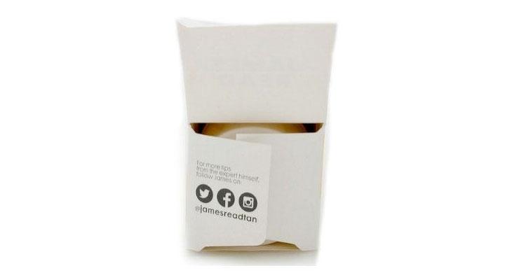
Enahance by James Read
Enhance by James Read
Country: France
James Read in France uses the white space of the carton to communicate social media information and remind consumers to connect with the brand online—a more effective approach than a regular mention of social media on the back of the pack.
Mintel research shows that only 6% of beauty and personal care consumers look for a website/social media link for a brand on pack before deciding whether to purchase a product or not.
Partially the reason hides behind social media information being hidden on pack without an ability to find it.
Leveraging empty space on the inside of the pack could prove to be more beneficial and drive more traffic to the brands’ website or social media.
The author, Viktorija Gnatoka, Global Packaging
Analyst at Mintel
Secondary packaging can also be perceived as excessive, a potential negative association, leading consumers to focus on the packaging as waste.
Increasingly Mintel has observed niche brands leveraging the “empty space” of outer packages for their own and consumers’ benefits.
Many packs are overwhelmed with information, so moving some of this to the inside of the cartons could help brands to declutter, leaving designs that are simple and easy-to-understand.
One category where this could show immediate gains is in skincare, for example, where Mintel research shows that 10% of female consumers agree that they do not understand many product claims. This is just one of the cases where brands could improve claim positioning by leveraging additional space on pack, giving information more room to communicate and win over the consumer.
Mintel’s GNPD (Global New Product Database) tracks new product launches around the world and we have noticed brands that are already leveraging the extra inner space of the outer cartons. Some companies are expanding and adding details about the product. The others are using that space to interact with consumers and engage them in a beauty regimen or specific brand cause.
Ciate Carton
Ciate Geltox by Ciate
Country: UK
Packaging for Ciaté Geltox Top Coat (at left) employs a simple, decluttered design principle and is decorated with a “mindful” use of color.
The design architecture carries over to the inside of the flip-top-style carton, where application instructions are easily accessed via a carton that is printed on the inside.
Pranarom International
Cosmétique Adaptarom Pranalixir by Pranarôm International
Country: France
Pranarôm Cosmétique Adaptarom (at left below) has effectively and simply combined graphics for application with a well-organized list of complementary products and attributes.
The designers have resisted the urge to cover every available internal space or available space with text or a graphic.
This strategy results in a vast amount of information being presented without appearing cluttered.
Eye & Mouth Mask by Fancl Beauty
Eye and Mouth Mask by Fancl
Country: Japan
Fancl Beauty Concentrate Eye and Mouth Mask packaging takes advantage of this lay-flat package style, using the underside of the flip-top lid to offer an easy-to-follow set of graphics and text communication instructions that allow for easy, no-hand reading, which aides in the simultaneous use of the product.
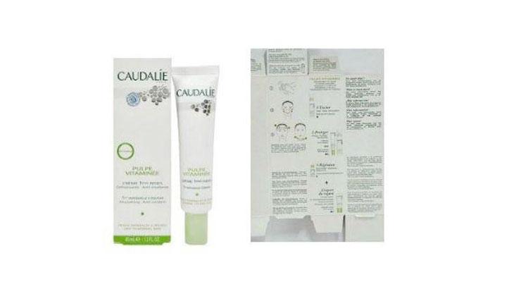
Caudalie
Caudalie
Caudalie
Pulpe Vitaminée 1st Wrinkle by Caudalie France
Country: France
Caudalie has employed a step-by-step set of show-and-tell instructions that don’t appear to be crowded or overbearing.
Consumers today rely on packaging as a communication tool to understand use/preparation instructions.
Highlighting brand or even functional packaging attributes using a combination of graphics and text (show and tell) communication tools share just enough to get the job done for those in a hurry, or the full story for consumers who want or need more information.
Estelle & Thild
BioHydrate by Estelle & Thild
Country: Sweden
Other brands are leveraging the opening part of the pack to give consumers quick reminders or simply showing that they care.
Estelle & Thild in Sweden adds a “What’s inside matters” phrase on both sides of the opening of the pack, which has a double meaning.
Tapping into the eternal question of “what is beautiful” the phrase reminds women about their inside beauty as well.
Enahance by James Read
Enhance by James Read
Country: France
James Read in France uses the white space of the carton to communicate social media information and remind consumers to connect with the brand online—a more effective approach than a regular mention of social media on the back of the pack.
Mintel research shows that only 6% of beauty and personal care consumers look for a website/social media link for a brand on pack before deciding whether to purchase a product or not.
Partially the reason hides behind social media information being hidden on pack without an ability to find it.
Leveraging empty space on the inside of the pack could prove to be more beneficial and drive more traffic to the brands’ website or social media.
