


Jamie Matusow, Editor-in-Chief01.30.17
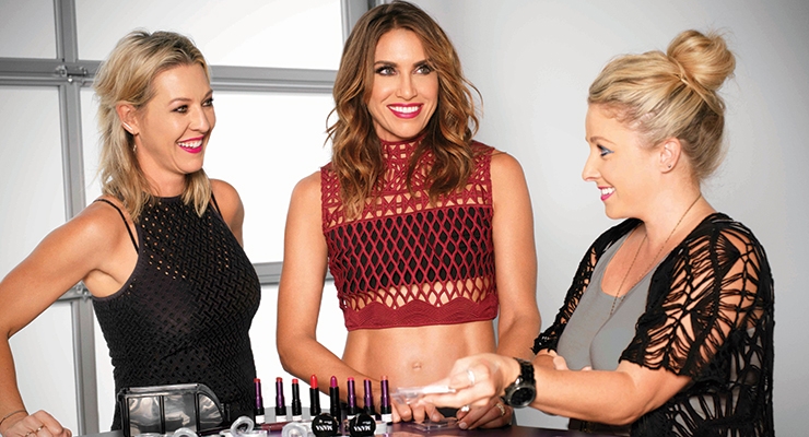
Lots of beauty brands launch numerous products over a year’s time—and a few even premier multiple collections. But Urban Decay’s prolific color cosmetic reveals may stand out more than most, as the highly rated formulas consistently surprise and delight—in whatever form—from palettes to pencils, lipsticks to nail polish, foundation to false eyelashes. And even more impressive, the popular collections and limited editions fit together so well—and are packaged in such covetable style—beauty aficionados anticipate each and every one and seemingly want to have them all, both for the bulk and the container.
The brand has rocked the beauty industry for two decades, with innovations from new color coordinates such as the industry-shaking Nude palette, imitated by many, to 3D popup diorama-like out-of-the-box packaging that syncs with Disney movie releases including “Alice Through the Looking Glass.”
Marisol Simard, founder of Dandelion CLocks, a consulting firm focused on innovative packaging for the beauty industry, says Urban Decay is deserving of Beauty Packaging’s title of Beauty Company of the Year: Excellence in Packaging “because they demonstrate their ability to successfully deliver stories through packaging artistry.”
Simard notes that a brand excels in packaging when they are successful in “making their packaging the artistry of strong sensorial experiences that consumers can relate to and want to be part of.” Further, she says, “By using a multitude of strong visual, tactile and audible cues all at once, Urban Decay’s packaging entertains and captures its audience. They succeed in standing out because they are generous and clever with the variety of materials they use in their packaging and are not stingy when it comes to artwork.” Simard says that Urban Decay has also succeeded in creating a contrast within their line, with something for everyone, from soft, quiet, neutrals to bold vibrant colors. “These opposites give Urban Decay a guaranteed on the shelf stand-out,” concludes Simard.
Developing in Tandem
Over the past 20 years, the brand has garnered a reputation for driving innovation in the beauty category by telling a consistent story that generates offbeat excitement. How do they continue to develop leading product after product, combining packaging artistry with form and function? Which comes first—the product or the package?
Wende Zomnir, Urban Decay’s cofounder and chief creative officer, who’s often referred to as the visionary behind the brand, tells Beauty Packaging: “When we create a new product, we develop the package and the product in tandem. They really are co-dependent, and we try to make them work together to tell the whole story of the product.” Zomnir says a concept can start with the formula or the packaging…it depends on where the inspiration comes from…which could be anywhere. The packaging, she explains, sets the framework for telling the story of what is inside.
When it comes to packaging inspiration, Zomnir keeps an open mind. She tells Beauty Packaging she likes to look at what’s going on with fashion, art and design. In addition, she also checks out new fabrics, patterns and motifs.
Beauty industry suppliers also play a critical role. Zomnir explains: “I meet with packaging people from all over the world to learn about new technology and what can be accomplished now in manufacturing…what new materials are available and how they can be combined.” She says, “Sometimes something you’ve seen at a movie or museum will click with something a packaging manufacturer has shown you and voilà—there’s your idea.”
Walking the Line Between Art & Commerce
Urban Decay products always “walk the fine line between art and commerce,” says Zomnir. “We believe that beauty products should speak to our customers and excite them, but at the end of the day, the product has to work.”
Karen Grant, global beauty industry analyst, The NPD Group—and a member of Beauty Packaging’s Board of Advisors, says UD’s success in breaking the mold of more traditional brands has earned them a key spot in the Prestige beauty arena, with packaging playing a major role along the way.
“Urban Decay has carved out their position as a top brand in Prestige beauty by their distinctive offering and packaging,” says Grant. “Blazing their way from the ubiquitous dark tones in the packaging of many brands, Urban Decay first caught the heightened attention of consumers with the revamp of their single eye shadows into bright, eye-catching silver tokens and the play of soft golden hues in the packaging of their record-breaking Naked palettes. From what could well be ammunition cartridges for Vice offerings to the Gilded Age details in their Vintage products to novelty embellishments in their applicator sets, Urban Decay has stylized their collections with packaging to reflect the mood of the individual lines and spark the excitement of consumers.”
Simard notes that the brand resonates with consumers, which is especially critical when it comes to selling in assisted self-service and e-commerce environments.
According to Simard, an Urban Decay strong point is that the brand succeeds in connecting with consumers through its packaging. She explains: “If your packaging is not visually strong in conveying your brand identity, your product line will be lost in the clouds. If your applicators don’t show off the makeup artist skills and do not make the customer look professional, she won’t promote your brand. If you don’t seduce the consumer visually nor satisfy all sensory cues, you will go unnoticed, unexplored and will remain on the shelf.”
To the contrary, Simard describes UD’s packaging as “generous, empathetic and highly sensorial; thoughtful and meaningful in its details; colorful; ergonomically conscious; artful; iconic; consistent; and reliable. She says the packaging creates a deeper connection with consumers and sometimes leads to “addiction” by loyal fans.
How It All Began
Urban Decay’s offbeat artsy philosophy—and its penchant for memorable packaging—has served as an overall anchor for its Prestige products. Twenty years ago, with the belief that makeup wearers everywhere craved alternatives, the brand embraced an edgy vibe with the introduction of a line of 10 lipsticks and 12 nail polishes to counter the overriding pastel shades that pervaded the cosmetics market. The belief was that people wanted the freedom to flaunt yellows, purples and greens on lips and nails.
Inspired by seedier aspects of the urban landscape, these products featured non-traditional beauty names such as Roach, Smog, Rust, Oil Slick and Acid Rain. An instantly recognizable UD logo, with a captivating deep purple hue, stands out on shelf—and on Instagram.
Zomnir says Urban Decay was born in 1996, because at that time, the prestige cosmetics floor was a sea of red, beige and pink. The idea, she explains, was to create a line of amazing, high-quality cool colors and completely shock the industry. “We didn’t want to just knock on the door of the cosmetics world, we wanted to knock it down,” says Zomnir.
Adding a little “grit” to beauty created a revolution of sorts which allowed consumers to step outside traditional beauty boundaries.
“Urban Decay came about during the grunge era of the mid-nineties,” explains Zomnir. “We were inspired by the urban landscape that surrounded us, it was all about finding beauty in things that were unconventionally beautiful, like the iridescent rainbow found in an oil slick. We were of the idea that there are a lot of other ways to be beautiful instead of subjecting yourself to stereotypes. Life is too short, wear blue lipstick. You don’t have to be afraid of anything you can wash off.”
Throughout Urban Decay’s history, there’s been one basic concept and a consistent story that ties together all of the brand’s products/packaging.
Zomnir tells Beauty Packaging: “We describe Urban Decay as feminine, a little dangerous and a lot of fun—and that comes through in everything we do, from the products we create and the names we give them, to the way we design our packaging and the experience that we create in stores. Urban Decay is all about empowerment through makeup. It’s not about covering your flaws, but showing the world who you are.”
Ultimately, these tenets are what makes Urban Decay stand out from other cosmetics brands, according to Zomnir, who says, “Urban Decay has a clear point of view and is all about the fun of self-expression through makeup. We create high-quality beauty products with innovative packaging and incredible colors. We continuously evolve the brand to keep it fresh, but we have always stayed true to the essence of what Urban Decay is: Beauty with an edge. And I work with an amazing group of people who all live it, breathe it and love it.”
Packaging Highlights of 2016—and Beyond
In 2016, alone, the SoCal brand launched dozens of products including multiple full palettes, and special collaborations including one with entertainer Gwen Stefani and another edition for Disney in conjunction with the “Alice Through the Looking Glass” movie release in August. And as we head into 2017, Urban Decay is showing no signs of slowing up, with new products and re-launches imminently hitting the market in cool packaging.
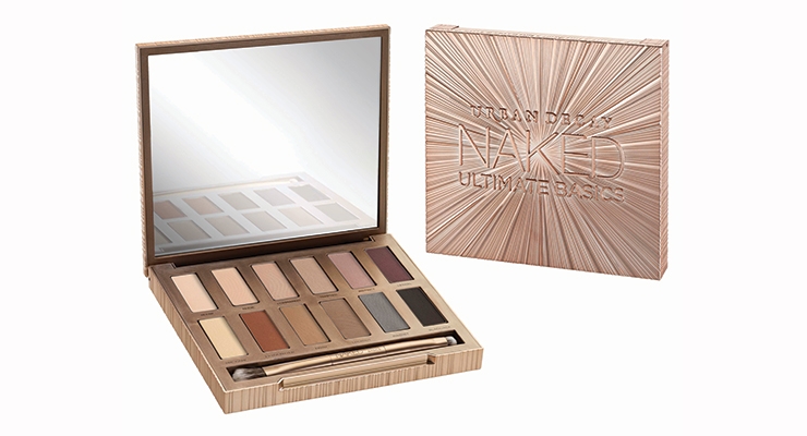
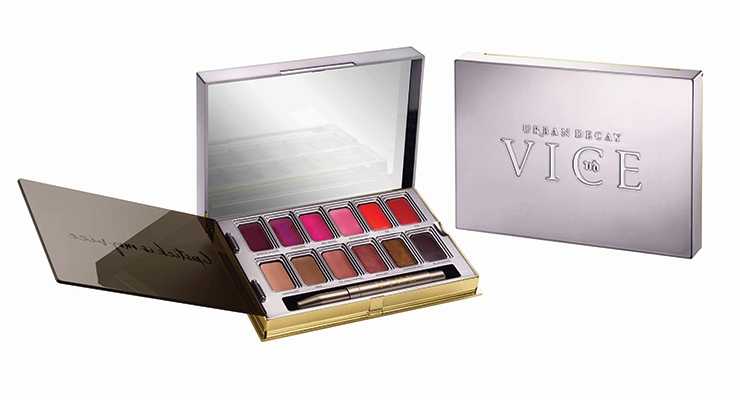
When asked what in particular made Urban Decay stand out packaging-wise in 2016, Zomnir doesn’t hesitate. She tells Beauty Packaging: “I think we innovated with our All Nighter Foundations, Naked Ultimate Basics Palette and Vice Lipstick Palette.”
Pulling an All Nighter
All Nighter foundation features full-coverage, a matte-finish, and an oil-free waterproof formula that lasts all night—and can be worn all day. One glance at the packaging promises this product will be different from other category offerings. Fusion Packaging executed the bold, avant-garde bottle for Urban Decay’s All Nighter foundation, which features a highly UV metallized, gunmetal effect with asymmetric cutouts that let the formula shade show through. The 30ml bottle is also outfitted with an airless pump that helps get every bit of product out.
Going Naked
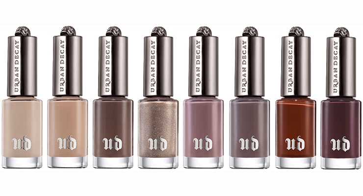
When Urban Decay introduced its first Naked eye shadow palette in 2010, they had an immediate success story on their hands as consumers clamored for the palette’s pale harmonious shades. Other brands took notice and Naked became a phenomenon within the beauty industry, with many imitator products hitting the market—but Urban Decay maintained its edge, releasing several follow-ups to this franchise in the past few years. The most recent launched this past September, and a line of nail polishes followed to complete an “overall naked look.”
The Naked palettes stand out as Urban Decay’s signature pieces, according to Simard, both for the formulations and the ergonomic packaging. She observes: “Notice that the narrow format of the packaging allows the consumer an easy way to hold the palette throughout its use cycle (opening, pigment pick-up, application, use of the mirror and closure)—she feels in control, she looks in control.”
All the details are thought out to appeal to the consumer and ensure a happy experience. Simard points to the elongated case, which also allows the incorporation of the right-sized accessories for the consumer to achieve the look she’s after. First, a long mirror that allows her to see both eyes at once, leading to a more uniform overall look. Second, the proper applicator—with a long handle that provides dexterity, and with fibers that pick up and deliver the desired amount of pigment. “She starts her day feeling empowered,” says Simard.
Never a brand to remain static, but one always looking to improve upon their packaging, Urban Decay’s newest launch in the series—Naked Ultimate Basics—lends a surprise element as its shape morphs from elongated to square, but it’s still just as user-friendly. The sleek golden case custom designed and produced by Compax draws attention via brilliant rays bursting from beneath the raised lettering on the cover. A dozen all-new neutral matte shades await inside, and each is exclusive to this palette. They can be used alone or paired with other Urban Decay shades for a huge variety of looks. (The previous palettes have all been a combination of matte and shimmer-y shadows.)
Shade names in the latest highly pigmented collection are sure to make an additional impact, with descriptors including Blow, Nudie, Commando, Tempted, Instinct and Lethal.
In a video announcing the launch, Zomnir commented on the new palette shape, saying: “I love the square because the mirror is really big. You can get in there and do your makeup. It’s perfect for traveling with, and this is a palette you’ll want to have with you all the time.”
Naked for Nails
On the heels of the new Naked Ultimate Basics palette, came another addition to the franchise: a limited edition, coordinating collection of eight new Urban Decay natural nail polish shades with what are described as “buttery, blendable formulas.”
According to the brand, each bottle is based on an eyeshadow from the Naked2, Naked Basics, or Naked Ultimate Basics palettes.
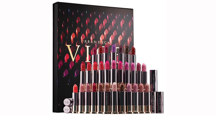
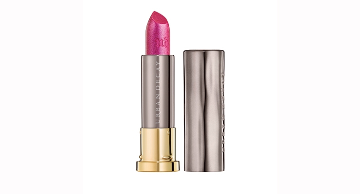
A Little Vice Is Good for the Lips
Urban Decay says its Vice Lipstick Palette was launched to appeal to the brand’s “beauty junkies.” It is the Vice Lipstick formula revisited—now poured into a palette for easy application—especially when on the go.
The palette appeals to the daring as well as the demure as it’s available in two colorways with multiple finishes and 12 shades from neutral to bright, dark to light, all drawn from the brand’s extensive collection. Users have access to shades that include Conspiracy (plum-bronze shimmer), Junkie (metallic green with gold micro-sparkle), Disturbed (deep brick red matte) and Speedball (deep purple cream).
The Vice Lipstick Palettes were designed for color experimentation. Shades can be mixed or layered, and are ideal for contouring and creating added depth and dimension. For even longer wear, lips can be primed with a coordinating shade of 24/7 Glide-On Lip Pencil.
The wells of the palette were designed with a special stair-step effect that’s ideal for wiping any excess lipstick off the retractable lip brush—and also keeping the lipstick in its compartment, not all over the palette. When application is complete, the attached cover can be flipped on top of the lipstick wells to keep the shades protected and the compact free of messes. The luxurious metallized gunmetal case has gold accents, just like the Vice Lipstick case.
Disney Collaboration
In 2016, Urban Decay released its second collaboration with Disney (in 2010, the brand released its highly acclaimed Book of Shadows to honor the original film).
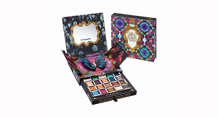
Urban Decay introduced the Alice Through the Looking Glass Eyeshadow Palette, inspired by the fantasy-adventure film release of Disney’s “Alice Through the Looking Glass,” which premiered in theaters in May 2016. This limited edition, pop-up palette, produced by HCT Group, paid tribute to the film’s characters by way of a mix of 20 all-new shades, which were arranged in columns by character.
Beauty fans could match up the columns or mix up the shades to create countless looks. The trippy palette features colorful, kaleidoscopic artwork with flowers and butterflies, and includes several quotes from the film. Hits of embossing and gloss give the palette a luxe, dimensional feel. When the lid is lifted and the doors inside are opened, a 3D butterfly springs up. Pulling open the palette’s drawer reveals the shadows. A double-ended brush is provided for a perfect application.
As far as the formulations, each eyeshadow in this palette features UD’s Pigment Infusion System, described as “a proprietary blend of ingredients that gives every shade its velvety texture, rich color, serious staying power and blendability.”
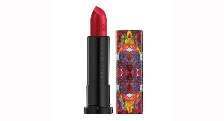
Alice Through the Looking Glass Lipsticks
According to Urban Decay, of its many projects with Disney, the Alice in Wonderland Book of Shadows had been their favorite—until they created the Alice Through the Looking Glass collection, with five limited-edition shades of lipstick to complement their latest Alice Eyeshadow Palette. Pairing the lipsticks with the eyeshadows, from sheer nude with a pink shift and bright red matte to gunmetal-navy with silver shimmer, these shades range from classic to edgy.
Each lipstick case features a colorful, kaleidoscopic pattern inspired by the film. As added deco features, the brand debossed the top of the cap and the lipstick with the UD icon and screened “Urban Decay” on the inside of the case.
Setting Up for 2017
What’s next for the beauty-obsessed fans of the brand? Any new collaborations on the horizon? Additional skus? Categories? New packaging?
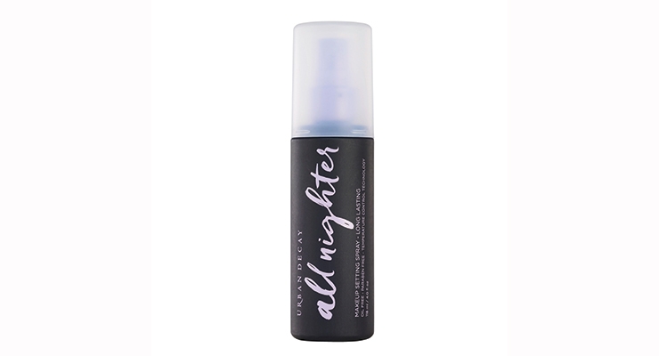
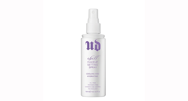
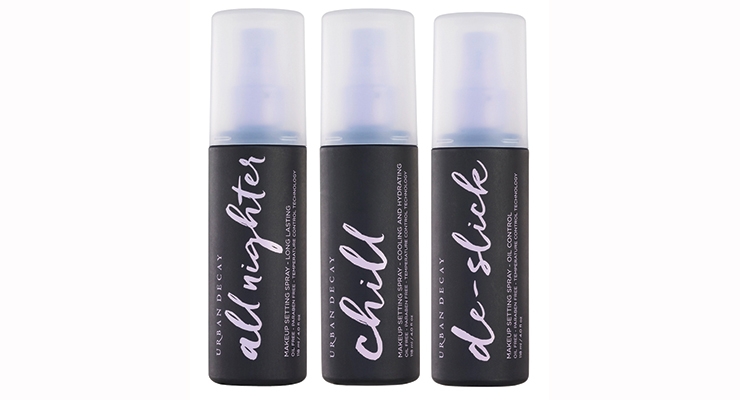
Zomnir tells Beauty Packaging: “We have some new exciting stuff coming for Spring 2017, including some packaging updates for our top skus. I love our All Nighter Setting Spray, I use it every day to make my makeup last all day.” She says that while it has been redesigned a couple of times since it launched, it was time for an update. The new package looks fresh and clean. Zomnir says, “I love the clean white package it’s in now, but being a beauty junkie, I always have makeup all over my hands and the bottle would end up looking dirty over time. We decided to put it in a black bottle with lavender text to keep it looking gorgeous on your vanity or in your kit.”
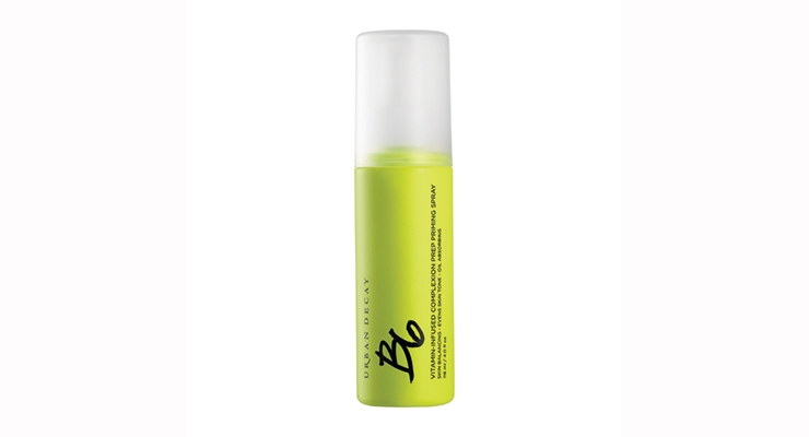
The new black and purple makeup setting spray bottles replace the former white and purple combination. Additionally, the bottle for the B6 spray, which was in purple packaging, has been updated to neon green.
Zomnir never hesitates to redo the packaging of a product until she’s satisfied. In a recent article for WWD, Zomnir said: “One of my philosophies has been we are never done. We have redone our eye shadows three or four times. That’s my mind-set, and people always love when we bring back products and make them better.”
Parting Notes
Primers, Sprays, Color palettes have all been big business for Urban Decay, and a great sense of pride for Zomnir. With all of these successes, what does she regard as her greatest achievement in the beauty industry?
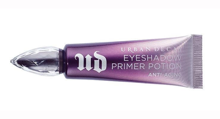
Zomnir tells Beauty Packaging: “I am most proud of creating our Eyeshadow Primer Potion. There was not anything like it in the industry at the time and it’s changed the way people apply their makeup. It allows you to apply eyeshadow more smoothly, intensifies the color and keeps eye makeup crease-free all day. I love hearing stories from customers about how life-changing this product has been for them.”
Breakthrough products aside, in the end, Zomnir says her true rewards come from the people behind the brand.
She says, “The most fulfilling thing for me has been to see my employees grow professionally. I’ve seen them go from having a fun job here, to having a career that they love and are truly successful in. Some of our employees have been here over 15 years.”
What is the overall takeaway from Urban Decay’s success story?
Simard, of Dandelion Clocks, says: “We should always be inspired and learn from brands that put the consumer at the core of their strategy. Urban Decay is a great example of a brand that pays attention to and incorporates in their packaging the ‘who She is, how She wants to be perceived, who She wants to be, what She struggles with, and what She stands for.”
How did the color cosmetics pro get her start?
“Like most women,” says Wende Zomnir, Urban Decay’s cofounder and chief creative officer, “I stole my first lipstick from my mother and I was addicted. I loved the smell, the feel, everything. There’s even a picture of me in a family photo album trying to apply mascara at age 2.” But the color cosmetics expert says her real love affair with makeup started when she was 13. “My mom got me one of those blockbuster sets and I never looked back. I even got sent home in eighth grade for wearing too much makeup.”
Zomnir says her entry into a professional role also began in an experiential way. “I was actually mixing nail polish on my porch and figuring out how to create UPC codes. Now I am heading up a much larger business while still being creative and doing my best to inspire the people around me.”
Alice Through the Looking Glass Collection: Eyeshadow Palette and Lipstick
All Nighter Foundation
Razor Sharp Liquid Eyeliner
Moondust Palette
Perversion Finepoint Pen
Makeup Bags – Clear & Classic Collections
UD Pro Brushes
UD Pro Stackable Artistry Palette
Full Spectrum Palette
Naked Ultimate Basics
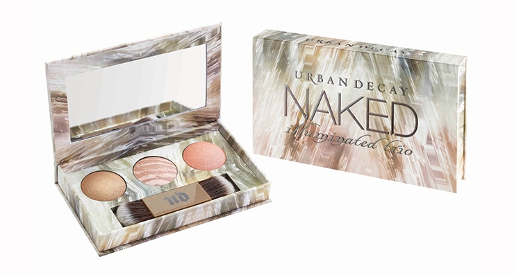
Naked Illuminated Trio
Liquid Moondust Eyeshadow
Urban Lash
Vice Lipstick Vintage Capsule Collection
Vice Lipstick Palettes
Naked Nail Color
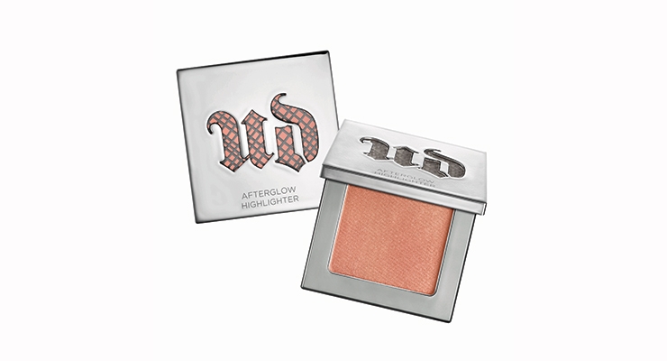
Afterglow Highlighter
Beached Bronzer
Naked Skin Color Correcting Fluids
Naked Skin One & Done
24/7 Waterline Eye Pencil in Walk of Shame
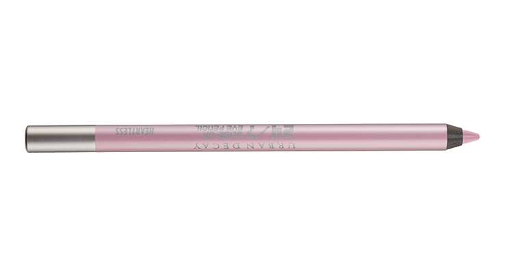
24/7 Glide-On Eye Pencil in Heartless
XX Vice LTD Reloaded
Naked Skin Weightless Ultra Definition Liquid Makeup – Shade Extensions
Naked Skin Weightless Complete Coverage Concealer – Shade Extensions
Vice Lipstick
24/7 Glide-On Lip Pencil
2017
Makeup Setting Sprays – Relaunch
Complexion Primers
Optical Illusion Complexion Primer
De-Slick Complexion Primer
Self-Adjusting Complexion Primer
Urban Defense Complexion Primer SPF 30
Quick Fix Hydra-Charged Complexion Prep Priming Spray
B6 Vitamin Infused Complexion Prep Spray
Urban Decay was founded in Los Angeles in 1996 and was purchased by the LVMH luxury group in 2000 before being sold two years later to the Falic Group (owners of the Perry Ellis fragrance lines). In 2009, Urban Decay was acquired by private equity fund Castanea Partners.
In 2012, L’Oréal signed an agreement with Castanea Partners to acquire Urban Decay in a deal estimated at $300 - $400 million.
The brand has rocked the beauty industry for two decades, with innovations from new color coordinates such as the industry-shaking Nude palette, imitated by many, to 3D popup diorama-like out-of-the-box packaging that syncs with Disney movie releases including “Alice Through the Looking Glass.”
Marisol Simard, founder of Dandelion CLocks, a consulting firm focused on innovative packaging for the beauty industry, says Urban Decay is deserving of Beauty Packaging’s title of Beauty Company of the Year: Excellence in Packaging “because they demonstrate their ability to successfully deliver stories through packaging artistry.”
Simard notes that a brand excels in packaging when they are successful in “making their packaging the artistry of strong sensorial experiences that consumers can relate to and want to be part of.” Further, she says, “By using a multitude of strong visual, tactile and audible cues all at once, Urban Decay’s packaging entertains and captures its audience. They succeed in standing out because they are generous and clever with the variety of materials they use in their packaging and are not stingy when it comes to artwork.” Simard says that Urban Decay has also succeeded in creating a contrast within their line, with something for everyone, from soft, quiet, neutrals to bold vibrant colors. “These opposites give Urban Decay a guaranteed on the shelf stand-out,” concludes Simard.
Developing in Tandem
Over the past 20 years, the brand has garnered a reputation for driving innovation in the beauty category by telling a consistent story that generates offbeat excitement. How do they continue to develop leading product after product, combining packaging artistry with form and function? Which comes first—the product or the package?
Wende Zomnir, Urban Decay’s cofounder and chief creative officer, who’s often referred to as the visionary behind the brand, tells Beauty Packaging: “When we create a new product, we develop the package and the product in tandem. They really are co-dependent, and we try to make them work together to tell the whole story of the product.” Zomnir says a concept can start with the formula or the packaging…it depends on where the inspiration comes from…which could be anywhere. The packaging, she explains, sets the framework for telling the story of what is inside.
When it comes to packaging inspiration, Zomnir keeps an open mind. She tells Beauty Packaging she likes to look at what’s going on with fashion, art and design. In addition, she also checks out new fabrics, patterns and motifs.
Beauty industry suppliers also play a critical role. Zomnir explains: “I meet with packaging people from all over the world to learn about new technology and what can be accomplished now in manufacturing…what new materials are available and how they can be combined.” She says, “Sometimes something you’ve seen at a movie or museum will click with something a packaging manufacturer has shown you and voilà—there’s your idea.”
Walking the Line Between Art & Commerce
Urban Decay products always “walk the fine line between art and commerce,” says Zomnir. “We believe that beauty products should speak to our customers and excite them, but at the end of the day, the product has to work.”
Karen Grant, global beauty industry analyst, The NPD Group—and a member of Beauty Packaging’s Board of Advisors, says UD’s success in breaking the mold of more traditional brands has earned them a key spot in the Prestige beauty arena, with packaging playing a major role along the way.
“Urban Decay has carved out their position as a top brand in Prestige beauty by their distinctive offering and packaging,” says Grant. “Blazing their way from the ubiquitous dark tones in the packaging of many brands, Urban Decay first caught the heightened attention of consumers with the revamp of their single eye shadows into bright, eye-catching silver tokens and the play of soft golden hues in the packaging of their record-breaking Naked palettes. From what could well be ammunition cartridges for Vice offerings to the Gilded Age details in their Vintage products to novelty embellishments in their applicator sets, Urban Decay has stylized their collections with packaging to reflect the mood of the individual lines and spark the excitement of consumers.”
Simard notes that the brand resonates with consumers, which is especially critical when it comes to selling in assisted self-service and e-commerce environments.
According to Simard, an Urban Decay strong point is that the brand succeeds in connecting with consumers through its packaging. She explains: “If your packaging is not visually strong in conveying your brand identity, your product line will be lost in the clouds. If your applicators don’t show off the makeup artist skills and do not make the customer look professional, she won’t promote your brand. If you don’t seduce the consumer visually nor satisfy all sensory cues, you will go unnoticed, unexplored and will remain on the shelf.”
To the contrary, Simard describes UD’s packaging as “generous, empathetic and highly sensorial; thoughtful and meaningful in its details; colorful; ergonomically conscious; artful; iconic; consistent; and reliable. She says the packaging creates a deeper connection with consumers and sometimes leads to “addiction” by loyal fans.
How It All Began
Urban Decay’s offbeat artsy philosophy—and its penchant for memorable packaging—has served as an overall anchor for its Prestige products. Twenty years ago, with the belief that makeup wearers everywhere craved alternatives, the brand embraced an edgy vibe with the introduction of a line of 10 lipsticks and 12 nail polishes to counter the overriding pastel shades that pervaded the cosmetics market. The belief was that people wanted the freedom to flaunt yellows, purples and greens on lips and nails.
Inspired by seedier aspects of the urban landscape, these products featured non-traditional beauty names such as Roach, Smog, Rust, Oil Slick and Acid Rain. An instantly recognizable UD logo, with a captivating deep purple hue, stands out on shelf—and on Instagram.
Zomnir says Urban Decay was born in 1996, because at that time, the prestige cosmetics floor was a sea of red, beige and pink. The idea, she explains, was to create a line of amazing, high-quality cool colors and completely shock the industry. “We didn’t want to just knock on the door of the cosmetics world, we wanted to knock it down,” says Zomnir.
Adding a little “grit” to beauty created a revolution of sorts which allowed consumers to step outside traditional beauty boundaries.
“Urban Decay came about during the grunge era of the mid-nineties,” explains Zomnir. “We were inspired by the urban landscape that surrounded us, it was all about finding beauty in things that were unconventionally beautiful, like the iridescent rainbow found in an oil slick. We were of the idea that there are a lot of other ways to be beautiful instead of subjecting yourself to stereotypes. Life is too short, wear blue lipstick. You don’t have to be afraid of anything you can wash off.”
Throughout Urban Decay’s history, there’s been one basic concept and a consistent story that ties together all of the brand’s products/packaging.
Zomnir tells Beauty Packaging: “We describe Urban Decay as feminine, a little dangerous and a lot of fun—and that comes through in everything we do, from the products we create and the names we give them, to the way we design our packaging and the experience that we create in stores. Urban Decay is all about empowerment through makeup. It’s not about covering your flaws, but showing the world who you are.”
Ultimately, these tenets are what makes Urban Decay stand out from other cosmetics brands, according to Zomnir, who says, “Urban Decay has a clear point of view and is all about the fun of self-expression through makeup. We create high-quality beauty products with innovative packaging and incredible colors. We continuously evolve the brand to keep it fresh, but we have always stayed true to the essence of what Urban Decay is: Beauty with an edge. And I work with an amazing group of people who all live it, breathe it and love it.”
Packaging Highlights of 2016—and Beyond
In 2016, alone, the SoCal brand launched dozens of products including multiple full palettes, and special collaborations including one with entertainer Gwen Stefani and another edition for Disney in conjunction with the “Alice Through the Looking Glass” movie release in August. And as we head into 2017, Urban Decay is showing no signs of slowing up, with new products and re-launches imminently hitting the market in cool packaging.
When asked what in particular made Urban Decay stand out packaging-wise in 2016, Zomnir doesn’t hesitate. She tells Beauty Packaging: “I think we innovated with our All Nighter Foundations, Naked Ultimate Basics Palette and Vice Lipstick Palette.”
Pulling an All Nighter
All Nighter foundation features full-coverage, a matte-finish, and an oil-free waterproof formula that lasts all night—and can be worn all day. One glance at the packaging promises this product will be different from other category offerings. Fusion Packaging executed the bold, avant-garde bottle for Urban Decay’s All Nighter foundation, which features a highly UV metallized, gunmetal effect with asymmetric cutouts that let the formula shade show through. The 30ml bottle is also outfitted with an airless pump that helps get every bit of product out.
Going Naked
When Urban Decay introduced its first Naked eye shadow palette in 2010, they had an immediate success story on their hands as consumers clamored for the palette’s pale harmonious shades. Other brands took notice and Naked became a phenomenon within the beauty industry, with many imitator products hitting the market—but Urban Decay maintained its edge, releasing several follow-ups to this franchise in the past few years. The most recent launched this past September, and a line of nail polishes followed to complete an “overall naked look.”
The Naked palettes stand out as Urban Decay’s signature pieces, according to Simard, both for the formulations and the ergonomic packaging. She observes: “Notice that the narrow format of the packaging allows the consumer an easy way to hold the palette throughout its use cycle (opening, pigment pick-up, application, use of the mirror and closure)—she feels in control, she looks in control.”
All the details are thought out to appeal to the consumer and ensure a happy experience. Simard points to the elongated case, which also allows the incorporation of the right-sized accessories for the consumer to achieve the look she’s after. First, a long mirror that allows her to see both eyes at once, leading to a more uniform overall look. Second, the proper applicator—with a long handle that provides dexterity, and with fibers that pick up and deliver the desired amount of pigment. “She starts her day feeling empowered,” says Simard.
Never a brand to remain static, but one always looking to improve upon their packaging, Urban Decay’s newest launch in the series—Naked Ultimate Basics—lends a surprise element as its shape morphs from elongated to square, but it’s still just as user-friendly. The sleek golden case custom designed and produced by Compax draws attention via brilliant rays bursting from beneath the raised lettering on the cover. A dozen all-new neutral matte shades await inside, and each is exclusive to this palette. They can be used alone or paired with other Urban Decay shades for a huge variety of looks. (The previous palettes have all been a combination of matte and shimmer-y shadows.)
Shade names in the latest highly pigmented collection are sure to make an additional impact, with descriptors including Blow, Nudie, Commando, Tempted, Instinct and Lethal.
In a video announcing the launch, Zomnir commented on the new palette shape, saying: “I love the square because the mirror is really big. You can get in there and do your makeup. It’s perfect for traveling with, and this is a palette you’ll want to have with you all the time.”
Naked for Nails
On the heels of the new Naked Ultimate Basics palette, came another addition to the franchise: a limited edition, coordinating collection of eight new Urban Decay natural nail polish shades with what are described as “buttery, blendable formulas.”
According to the brand, each bottle is based on an eyeshadow from the Naked2, Naked Basics, or Naked Ultimate Basics palettes.
A Little Vice Is Good for the Lips
Urban Decay says its Vice Lipstick Palette was launched to appeal to the brand’s “beauty junkies.” It is the Vice Lipstick formula revisited—now poured into a palette for easy application—especially when on the go.
The palette appeals to the daring as well as the demure as it’s available in two colorways with multiple finishes and 12 shades from neutral to bright, dark to light, all drawn from the brand’s extensive collection. Users have access to shades that include Conspiracy (plum-bronze shimmer), Junkie (metallic green with gold micro-sparkle), Disturbed (deep brick red matte) and Speedball (deep purple cream).
The Vice Lipstick Palettes were designed for color experimentation. Shades can be mixed or layered, and are ideal for contouring and creating added depth and dimension. For even longer wear, lips can be primed with a coordinating shade of 24/7 Glide-On Lip Pencil.
The wells of the palette were designed with a special stair-step effect that’s ideal for wiping any excess lipstick off the retractable lip brush—and also keeping the lipstick in its compartment, not all over the palette. When application is complete, the attached cover can be flipped on top of the lipstick wells to keep the shades protected and the compact free of messes. The luxurious metallized gunmetal case has gold accents, just like the Vice Lipstick case.
Disney Collaboration
In 2016, Urban Decay released its second collaboration with Disney (in 2010, the brand released its highly acclaimed Book of Shadows to honor the original film).
Urban Decay introduced the Alice Through the Looking Glass Eyeshadow Palette, inspired by the fantasy-adventure film release of Disney’s “Alice Through the Looking Glass,” which premiered in theaters in May 2016. This limited edition, pop-up palette, produced by HCT Group, paid tribute to the film’s characters by way of a mix of 20 all-new shades, which were arranged in columns by character.
Beauty fans could match up the columns or mix up the shades to create countless looks. The trippy palette features colorful, kaleidoscopic artwork with flowers and butterflies, and includes several quotes from the film. Hits of embossing and gloss give the palette a luxe, dimensional feel. When the lid is lifted and the doors inside are opened, a 3D butterfly springs up. Pulling open the palette’s drawer reveals the shadows. A double-ended brush is provided for a perfect application.
As far as the formulations, each eyeshadow in this palette features UD’s Pigment Infusion System, described as “a proprietary blend of ingredients that gives every shade its velvety texture, rich color, serious staying power and blendability.”
Alice Through the Looking Glass Lipsticks
According to Urban Decay, of its many projects with Disney, the Alice in Wonderland Book of Shadows had been their favorite—until they created the Alice Through the Looking Glass collection, with five limited-edition shades of lipstick to complement their latest Alice Eyeshadow Palette. Pairing the lipsticks with the eyeshadows, from sheer nude with a pink shift and bright red matte to gunmetal-navy with silver shimmer, these shades range from classic to edgy.
Each lipstick case features a colorful, kaleidoscopic pattern inspired by the film. As added deco features, the brand debossed the top of the cap and the lipstick with the UD icon and screened “Urban Decay” on the inside of the case.
Setting Up for 2017
What’s next for the beauty-obsessed fans of the brand? Any new collaborations on the horizon? Additional skus? Categories? New packaging?
Zomnir tells Beauty Packaging: “We have some new exciting stuff coming for Spring 2017, including some packaging updates for our top skus. I love our All Nighter Setting Spray, I use it every day to make my makeup last all day.” She says that while it has been redesigned a couple of times since it launched, it was time for an update. The new package looks fresh and clean. Zomnir says, “I love the clean white package it’s in now, but being a beauty junkie, I always have makeup all over my hands and the bottle would end up looking dirty over time. We decided to put it in a black bottle with lavender text to keep it looking gorgeous on your vanity or in your kit.”
The new black and purple makeup setting spray bottles replace the former white and purple combination. Additionally, the bottle for the B6 spray, which was in purple packaging, has been updated to neon green.
Zomnir never hesitates to redo the packaging of a product until she’s satisfied. In a recent article for WWD, Zomnir said: “One of my philosophies has been we are never done. We have redone our eye shadows three or four times. That’s my mind-set, and people always love when we bring back products and make them better.”
Parting Notes
Primers, Sprays, Color palettes have all been big business for Urban Decay, and a great sense of pride for Zomnir. With all of these successes, what does she regard as her greatest achievement in the beauty industry?
Zomnir tells Beauty Packaging: “I am most proud of creating our Eyeshadow Primer Potion. There was not anything like it in the industry at the time and it’s changed the way people apply their makeup. It allows you to apply eyeshadow more smoothly, intensifies the color and keeps eye makeup crease-free all day. I love hearing stories from customers about how life-changing this product has been for them.”
Breakthrough products aside, in the end, Zomnir says her true rewards come from the people behind the brand.
She says, “The most fulfilling thing for me has been to see my employees grow professionally. I’ve seen them go from having a fun job here, to having a career that they love and are truly successful in. Some of our employees have been here over 15 years.”
What is the overall takeaway from Urban Decay’s success story?
Simard, of Dandelion Clocks, says: “We should always be inspired and learn from brands that put the consumer at the core of their strategy. Urban Decay is a great example of a brand that pays attention to and incorporates in their packaging the ‘who She is, how She wants to be perceived, who She wants to be, what She struggles with, and what She stands for.”
How did the color cosmetics pro get her start?
“Like most women,” says Wende Zomnir, Urban Decay’s cofounder and chief creative officer, “I stole my first lipstick from my mother and I was addicted. I loved the smell, the feel, everything. There’s even a picture of me in a family photo album trying to apply mascara at age 2.” But the color cosmetics expert says her real love affair with makeup started when she was 13. “My mom got me one of those blockbuster sets and I never looked back. I even got sent home in eighth grade for wearing too much makeup.”
Zomnir says her entry into a professional role also began in an experiential way. “I was actually mixing nail polish on my porch and figuring out how to create UPC codes. Now I am heading up a much larger business while still being creative and doing my best to inspire the people around me.”
Alice Through the Looking Glass Collection: Eyeshadow Palette and Lipstick
All Nighter Foundation
Razor Sharp Liquid Eyeliner
Moondust Palette
Perversion Finepoint Pen
Makeup Bags – Clear & Classic Collections
UD Pro Brushes
UD Pro Stackable Artistry Palette
Full Spectrum Palette
Naked Ultimate Basics
Naked Illuminated Trio
Liquid Moondust Eyeshadow
Urban Lash
Vice Lipstick Vintage Capsule Collection
Vice Lipstick Palettes
Naked Nail Color
Afterglow Highlighter
Beached Bronzer
Naked Skin Color Correcting Fluids
Naked Skin One & Done
24/7 Waterline Eye Pencil in Walk of Shame
24/7 Glide-On Eye Pencil in Heartless
XX Vice LTD Reloaded
Naked Skin Weightless Ultra Definition Liquid Makeup – Shade Extensions
Naked Skin Weightless Complete Coverage Concealer – Shade Extensions
Vice Lipstick
24/7 Glide-On Lip Pencil
2017
Makeup Setting Sprays – Relaunch
Complexion Primers
Optical Illusion Complexion Primer
De-Slick Complexion Primer
Self-Adjusting Complexion Primer
Urban Defense Complexion Primer SPF 30
Quick Fix Hydra-Charged Complexion Prep Priming Spray
B6 Vitamin Infused Complexion Prep Spray
Urban Decay was founded in Los Angeles in 1996 and was purchased by the LVMH luxury group in 2000 before being sold two years later to the Falic Group (owners of the Perry Ellis fragrance lines). In 2009, Urban Decay was acquired by private equity fund Castanea Partners.
In 2012, L’Oréal signed an agreement with Castanea Partners to acquire Urban Decay in a deal estimated at $300 - $400 million.
